Finding Game's Visual Identity: Tips for Selecting an Art Style
Introduction
Whether a game is big or small, intricately designed or simple and easy to access, the very first elements players will notice and pay attention to will be the aesthetics of the project. The underlying gameplay loops, music, and level design are crucial, but it is the visuals of the game that will have the most immediate impact.
Aesthetics encompasses more than the graphical fidelity of a project; a game does not require highly detailed and full of cutting-edge rendering techniques to have a solid game art style. Color palettes, proportions, UI design, and style choices are also crucial considerations. Whether we're a small indie team or a pre-established studio working on the next big thing, let's dive into some of the main elements to consider to maximize the impact for our players.
Genres have standards for a reason
First and foremost, a critical determining factor of aesthetic choices hinges on the genre of the game itself. Some expectations come with specific genres, and while there is always room for experimentation, being mindful of these established conventions and choices is crucial to securing a compelling, bold aesthetic for the project.
For example, wide-shot aerial cameras are incredibly prevalent within the RTS genre. This camera perspective allows for more effective strategizing due to the broader visibility field. This influences the aesthetic choices; units are designed to be visibly apparent, with bright color patterns to indicate team ownership and emphasize top-heavy design work on their models. Determining the unit type and affiliation quickly helps make for a quicker, more streamlined gameplay experience.

Starcraft 2 (RTS). Focus is put on the upper halves of the units, as these are the parts of the models that players can see from this angle, with bright colors determining ownership.
In contrast to most modern RTS design work, the recent emergence of retro-based platformers as a popular genre also presents a unique field of requirements to ensure a good synergy between the game's aesthetics and the gameplay's genre.
This genre of retro-platformer games has become popular amongst indie developers because the aesthetics are easier to achieve with a limited budget. Built on quick, moment-to-moment action and often focused on a singular character, with prominent terrain and clearly defined palettes distinguishing the player and other entities. The aesthetics try to invoke feelings of nostalgia without falling for old design traps such as unclear, muddy terrain design or lack of cohesion found in many of their ancestral inspirations.

Shovel Knight's foreground elements pop with contrasting colors from the background and the player character. This retro aesthetic has proven efficient at clearly directing the player on what is and isn't interactable.
There are reasons for these established game art style choices for these genres, which go beyond making the games look presentable. They act as a shorthand for the player, assisting in their understanding of the game. Even outliers use conventions for this effect, such as “Pikmin.” It still has the pulled-out wide shot camera for a more transparent presentation of the units you micromanage, accented by color to indicate their abilities.
The most uncomplicated takeaway from this part is to pay attention to the established conventions of these genres and learn from existing titles; these aesthetic choices work. They exist because years of trailblazing and experimentation have led to this point.
Focus on the core of the Project
With the above examples, moment-to-moment action is the focus of these genres. Still, it is presented in a drastically different manner as to the requirements of the genres they belong to respectively. While significant, not all games require complex characters or environments and instead focus on statistical layouts and numerical minutia, often found within 4X games. As a result, these titles will have different goals in mind for their aesthetics.

Civilization 6 focuses more on UI and conveying information to the end user. While aesthetically pleasing, this game is more focused on conveying information for 4x players and not necessarily on individual characters on screen.
The premise is simple. The aesthetic choices should reflect the title's focus, as they reinforce the intentions of the game design as a whole. In the case of management sims, focusing on a clear, concise, detailed UI becomes more crucial than beautifully rendering foliage, which would be more relevant to an open-world game where the intention is to build a vast world to explore.
This notion has already been capitalized heavily by several indie projects, especially those of a more narrative or metaphoric nature. Many indies have had great success tapping into their visuals and making them cohesive with the messaging and tone they wish to convey with their projects.

Gris's striking, hauntingly beautiful aesthetic focus builds on ruinous environments, reinforcing a sense of an empty, broken world. The game's core themes deal with grief and loss, and thus each location reflects this theme with great effect.
This notion goes beyond the idea of "aesthetics as a function" and more as a shorthand advert for the title's content. Consumers will often focus on the aesthetics of a title before they get to hold the controller, so it only makes sense for the aesthetics to resemble the focus of these titles. If the aesthetics are tuned into this focus, then the game can only stand to benefit from this synergy.
Hardware comes with hardships
Platform choice is absolutely crucial in aesthetic choice as well. A mobile phone doesn't kick out as much power as a hardcore gaming PC, and consoles have limitations too that must be considered. A title on the PS5 may not run so well on Xbox Series X, and may not run at all on Switch.
Unless your studio is dedicated to maximizing performance on every system, the weakest platform will likely determine your baseline specifications for the project. This results in sacrifices being made across all versions to cater to this weaker hardware.
Maximizing the visual style and uniqueness due to the restrictions presented by the hardware is often the most popular course of action for titles, allowing the game to stand out visually without requiring higher benchmarks that can cause the target platform to grind to a halt.

Yoshi’s Crafted World is a game for the Nintendo Switch platform. The aesthetics are built on the unique premise of craft materials, which helps the game compete visually with similar mascot-orientated projects found on systems with higher specifications.
Developing a game for a touchscreen mobile device is entirely different from that of a console. These games often need to be built with clearly indicated interactive buttons on the screen. Most players have no widely available alternative to the touchscreen controls and varying resolutions between models.

Plants vs. Zombies. The UI and elements are presented as clearly as possible. Large, zoned-out squares and clearly marked UI help the player understand what’s happening and interact easily with the touch-screen interface.
UI design becomes more complicated and needs to be able to adapt to multiple resolutions. The margin of error for inputs on a touchscreen and screen resolution can vary from device to device. Mobile also tends to have a minimalist presentation of its UI purely because the nature of it existing so close to the actual game field can become distracting for specific players.
When working on a project for mobile platforms, consideration of the aspect ratio and testing for multiple resolutions will be crucial in establishing a game art style that works for as many platforms as possible.
In essence, any design choices must be conscious of the limitations and specifications of the target hardware. Testing with the target hardware will save the heartache and frustration associated with redesigning UI and graphics that often comes with porting to new hardware.
Know your Team (and what it’s missing!)
Focusing on the team's strengths, especially in the field of aesthetics, goes a long way with game development. Smaller studios will struggle to compete with triple-A experiences. However, the team members they have on board still carry specific talents and skills that can help define a uniquely compelling visual presentation for the project. This all hinges on knowing your team and what they excel at. If the talent primarily focuses on 2D art, pivoting to 3D without preparation could prove a painful growing process that could ruin team morale and hinder the overall aesthetic. Even simplistic 2D visuals can be effective, as shown by many indie titles that deliberately harken back to older, more nostalgic game art styles.

Hyperlight Drifter's main art lead, Alx Preston, previously came from an illustration background, not pixel art. They employed their skillsets with this new medium, and were able to create a bold and unique aesthetic that was also manageable.
"Like many other small game developers -- I found that working in a lower resolution, working with pixel art is much more efficient." Alex Preston
The choices made within Hyperlight Drifter's aesthetics are often atypical of most other pixel-art-based titles and stem from Alx Preston's previous experience as an illustrator. An emphasis on blocky shapes that emphasize the pixel art nature instead of obscuring it and the use of after-effects on top of the pixel art results in a visually unique title. The team on Hyperlift Drifter knew exactly where their strengths were, and capitalized on this.
The flip side of this is having a triple-A team size and scope. All bets are effectively off in this situation, and the gloves come off…
At least, this is the expectation, but budget and skill are still a colossal consideration even in these situations. With a more complicated, higher fidelity aesthetic comes the additional concerns of materials such as lighting, cinematography, and several other elements that may have yet to be initially conceived for the project.
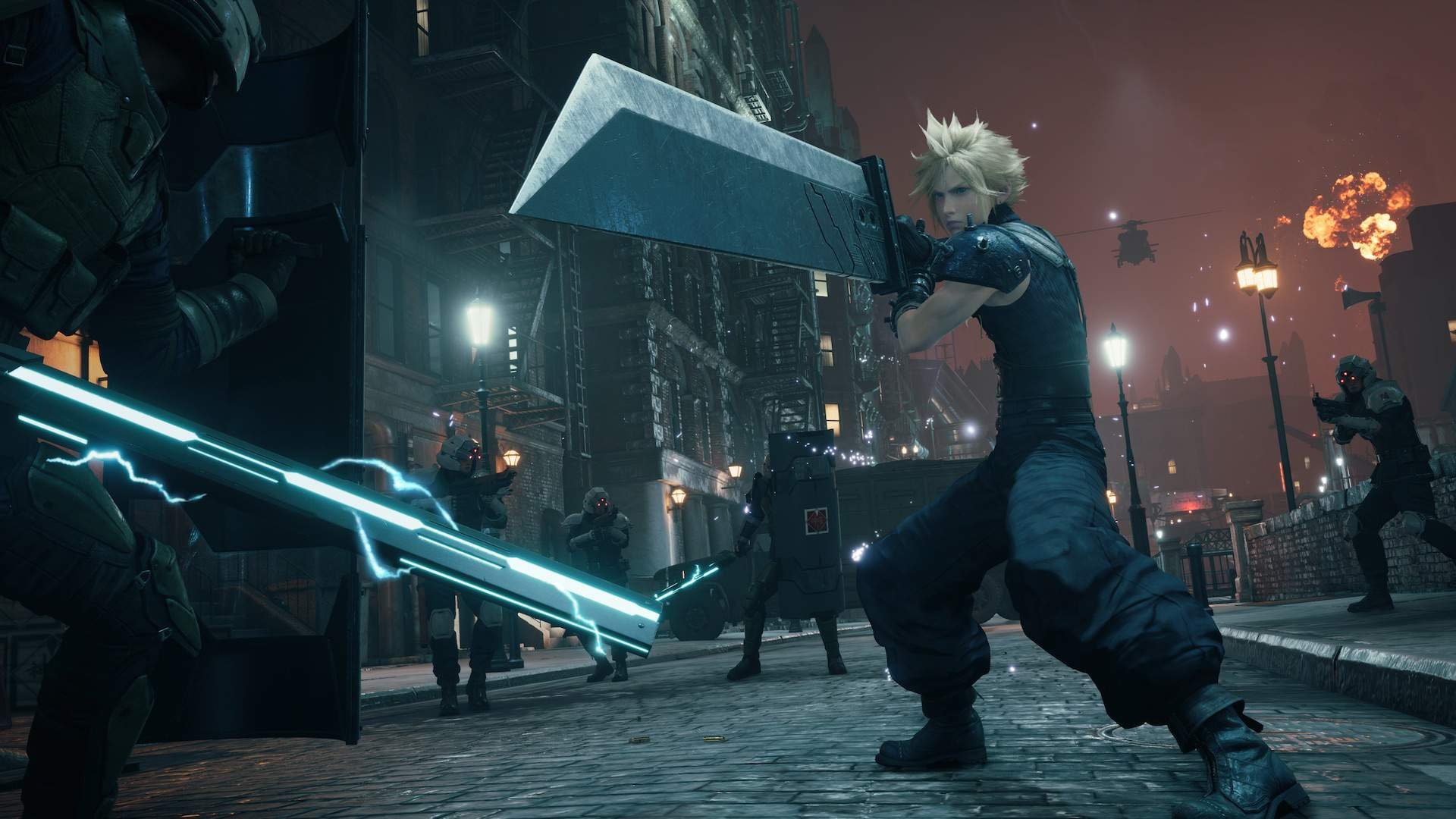
Final Fantasy 7 Remake - Integrade had a massive 200+ person team, and this still wasn’t enough for their ambitions for the project. Square Enix pulled in a new team of lighting experts ( source here ) to achieve the desired effect.
This attention to high-fidelity presentation and cinematography can often become the bane of most medium-sized teams. The team may be able to produce high-quality model work, but to expect them to develop complex lighting or rigging for scenes when they have minimal experience in these fields can lead to disappointing, frustrating results.
Knowing your team's skillset and adapting to find talent to fill any weaknesses to address these issues is a wise move to make. It goes without saying, but if your studio or team is really hellbent on working with raytracing, high-definition textures, and fully rendered aesthetics, it may require experts outside your team's size. Identifying these holes in talent and filling them can be the difference between a manageable project and one that sheds existing talent due to overwork, over-scope, and overdemanding expectations of the team's current capabilities.
Know your Audience as well!
Knowing your game's audience and who is playing your project is, by and large, one of the most significant contributors to the aesthetic choices made for the title and the focus spent on these assets.
The rise in low-fi, low poly 3D aesthetics in the indie market has been facilitated by the growing number of gamers who have a nostalgia for such titles. This audience has been a critical factor in the rise of such products, games that would have struggled in previous years where the target audience was focused on the constant specifications war between consoles and graphic pushes for clearer, more realistic visuals.

Lunacid (currently in early access) is an indie game built on the nostalgia of old-school PSX and PS2 adventure dungeon crawler games such as “King’s Field” or “Shadow Tower.” This game may not have the outreach of a mainstream title, but if it can cultivate an audience fitting its scale and scope, it should still become a successful title.
While Lunacid is an example of a title trying to tap into this recent growth in nostalgia and throwback titles, other games continue the push for increasingly cinematic experiences with excellent results. The recently released God of War: Ragnarok sold 5.1 million copies within its first week of release ( source here ).
Not all games need to aim for a specific niche target audience or push for intense cutting-edge graphics to cast the net as wide as possible. Establishing a game art style that taps into audience expectations and is economical has been achieved by many titles, such as the Kingdom Rush franchise on mobile.

Kingdom Rush: Vengeance has maintained a consistent visual style throughout its lifespan, even from its earlier days on armorgames.com. This aesthetic appeals to its target audience, who are looking for a clear, simple tower defense game to enjoy.
Kingdom Rush has established itself as a successful franchise by knowing its audience expects a competently presented tower-defense game with clean, representative graphics in a familiar art style and aesthetic presentation. The audience isn’t looking for experimental visual design, and the developers of Kingdom Rush know this. It’s a functional aesthetic that hasn’t required a constant race to push graphical fidelity.
The notion that Lunacid can still carve out a potential space in the market through its aesthetics and appeal to a target audience through them and that Kingdom Rush has been a successful franchise for over 10 years is a testament to paying attention to the demands of audiences and focusing on them.
If you build it, they will come, providing you know who they are and what they want.
Time management is crucial
The time taken to achieve the right visual style and flair is another primary consideration for establishing a project's aesthetics.
Every project has a deadline, which is often determined by many factors, including publisher schedules, funds, and availability of talent. Simply put, the effort put into specific game art style choices can result in longer development times and run the risk of delays and lowering morale for everyone on the project.

The Last Guardian is a beautiful project that took 9 years to complete with a fully staffed 100+ person team. The obsession with perfecting the game's aesthetic led to several concerns from within the company. Perfectionism can negatively impact team morale and the stability of the project as a whole. ( source here )
Making games is hard. This is obvious. But the extent to which creating a project is often underestimated by teams large and small. The Last Guardian was an example of a title with Sony's backing and still experienced crunch and continuous rolling delays. The focus on the aesthetics of this title literally added years to the project's production cycle. The obsession with perfection resulted in a beautiful game, but a game that had troubled development and strife throughout.

Loop Hero was in development for about 1.5 years and has seen substantial success under Devolver Digital's publishing label with its bleak and dark pixel aesthetic. It is worth noting that, even with an economic model, the team still experienced crunch during the last few months of development. ( source here ). Even with a relatively budget product, it may be best for small groups to increase their development time simply for the sake of the team's mental well-being.
Loop Hero succeeds in being uniquely engaging and standing out visually within the marketplace. With this game title experiencing crunch time, is it possible to release a project that can be visually appealing and stay on target?

Hades had a total development time of 3 years, launched in early access, and won Game of the Year for 2018. Supergiant Games have been consistent in scoping its games. Hades focuses on a clean, gothic digital art style as opposed to a hyper-detailed realistic presentation, resulting in a quicker development cycle.
Supergiant Games has a policy of “no enforced crunch” ( source here ) within its studio and has consistently produced indie-sweethearts titles across several markets and hardware platforms. They have cultivated a culture that mostly avoids excessive work hours and crushing deadlines. This is all facilitated by knowing their team’s skills and competencies, understanding the expectations of the genres they specialize in (top-down action-orientated titles such as Bastion and Transistor), and the confidence in their aesthetic design choices reflecting the focus and intent of their titles. They’ve been able to achieve the holy grail of winning a game of the year award, all without draining the morale or happiness of their talent.
Conclusion
Regardless of size, every genre of game has certain expectations. Specific trends can be broken into experimental or unique, but there are excellent reasons for certain aesthetic choices being made within genres; they indicate visual information the fastest to the player. Awareness of them and using them can help the audience identify what they're looking at and if it's been competently put together.
Beyond this, focusing on the game's strengths through the visuals is crucial because it shows the audience what the game experience is tailored to. Many gamers seek the thrill of Civilization 6's growing numbers and sense of scale. Its visual design reflects this through the emphasis on its heavy use of UI. Likewise, the visual focus of titles such as Gris indicates that the game is more than just a platformer title. The visuals have been crafted intentionally to convey the binding theme of grief.
The above points discuss game art style as a purely academic design concept, but the truth lies in a middle ground between artistic intention and physical production reality.
Sacrifices will inevitably need to be made if goals are too lofty, be it team morale or project quality. The target hardware will affect more than just benchmark figures, as each piece of equipment has vastly different requirements and limitations. Knowing the project's scope and target audience and honing the team's skills are part of creating a compelling aesthetic for the project as a whole. Only some teams can produce a triple-A masterpiece in terms of visual design, which is perfectly fine.
Establishing a compelling, powerful aesthetic is as much about execution as it is about aspiration. Be intentional with the aesthetic focus. Be aware of audience desires and genre expectations. Know your team's capabilities and scope of the visuals to be attainable within the deadline, and the project will hit its mark. The visuals will become more than set-dressing and indicative of the entire experience. A shorthand signature of the identity and soul of the game, inviting all to enjoy.